-
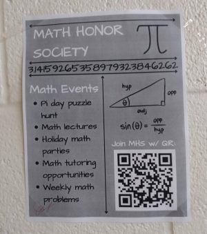
Math Honor Society
It has a nice range of shades. The layout is good, though I would switch the QR code and the triangle. I’d probably put math tutoring at the top because it is a very good selling point.
Photo by Jael Smith
-
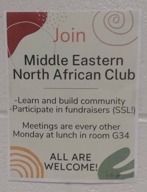
MENA
They have a good background which makes you focus on the words. It is in color, always a plus, but the font being just plain Arial takes it down. They mention when the club meets and the point of it.
Photo by Jael Smith
-
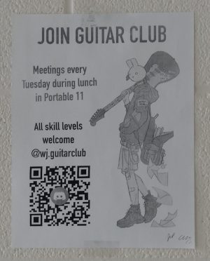
Guitar Club
Great layout, great art, direct. Has a QR code to the discord so people are directly connected to the members. Overall great, though it could use color and a link to a signup sheet.
Photo by Jael Smith
-
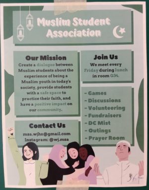
Muslim Student Association
Straight to the point. In color, it has pictures that are relevant to the club. The name is bolded. It just catches your eye and makes you want to read it.
Photo by Jael Smith
-
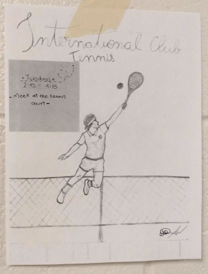
International Club Tennis
The poster is very direct and to the point. The image is beautiful but needs to be inked. The cursive is kind of hard to read. One suggestion is to type out when the meeting is in the box.
Photo by Jael Smith
What makes a good poster? A good poster usually has: some color, a clear title, some way to sign up for the club, an intriguing visual and some information about the club. Many posters at our school are very helpful and make you want to read more about the club, but many could be improved upon. For a rule of thumb, when you are making a poster for a club, make the title of your club the largest words on it, mention when you meet and what your club is about; make sure that the words are aligned.
Story continues below advertisement


